Making a complex organization easier to understand
Sometimes the fastest way to explain something is to draw it.
Through my work with nonprofits, something I have observed is that to make a concept real to other people, you have to put it into a format that they can see and understand.
This often means taking a swirl of ideas out of your head and putting them on paper. A diagram can make your own internal model of something visible, and therefore accessible to other people.
Something else I have observed is that a diagram doesn’t automatically create clarity. The process of diagramming is what creates clarity. As you place information into a diagram, connections can become visible that were previously hidden, or you may find that certain pieces of information are not part of the system at all. You may consult with a colleague and find that their interpretation of the same information is different, and by resolving that gap in understanding you may create additional clarity.
I've seen this play out on projects of all sizes. Kinship Community Food Center is a client I have worked with for almost a decade, supporting them through the communication challenges that arise from growth. As they began to reach larger audiences, they found a need to externalize their internal model in a way that people could quickly understand and support.
Background & Challenge
Kinship’s work extends far beyond food access. Their model moves away from the traditional model of a food pantry, bringing people into belonging and long-term stability through an ecosystem of services and an invitation to go deeper. They had a strong internal understanding of the model, but it lived primarily in conversations and experience. To help new audiences understand Kinship, that model first had to become visible.
Our Objectives
Translate Kinship's internal model into a set of branded, visual tools.
Create diagrams that clarify the model through the process of making them.
Produce reusable communication assets with the right balance of simplicity and nuance.
What We Delivered
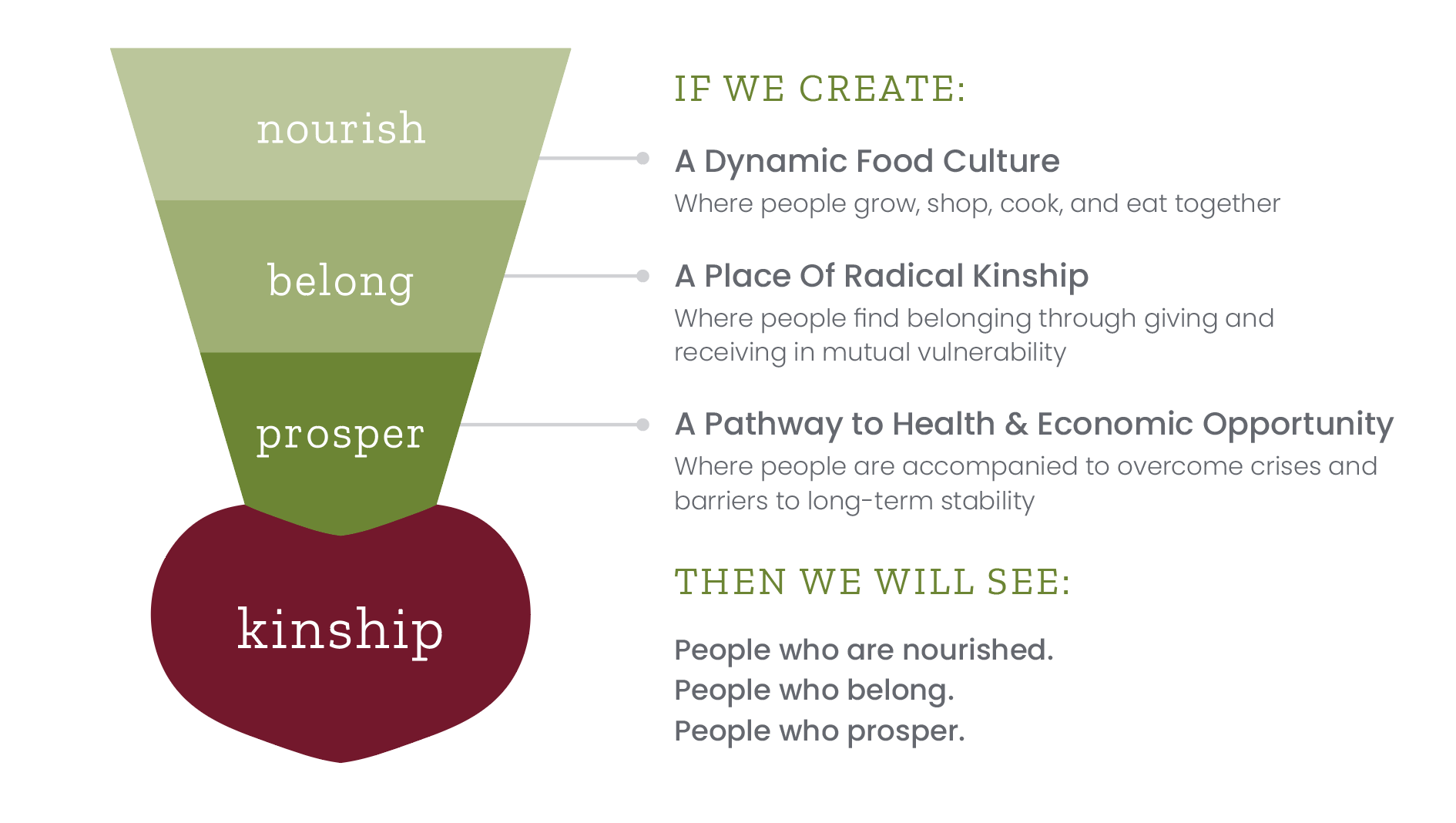
Theory of Change diagram
A one-glance view that ties the mission pillars to the mission.
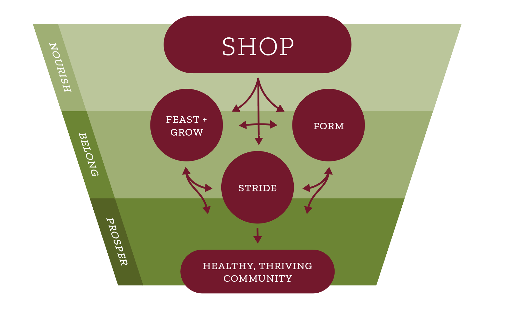
Journey Map
Shows how people typically enter through Shop and may “go deeper” into other programs
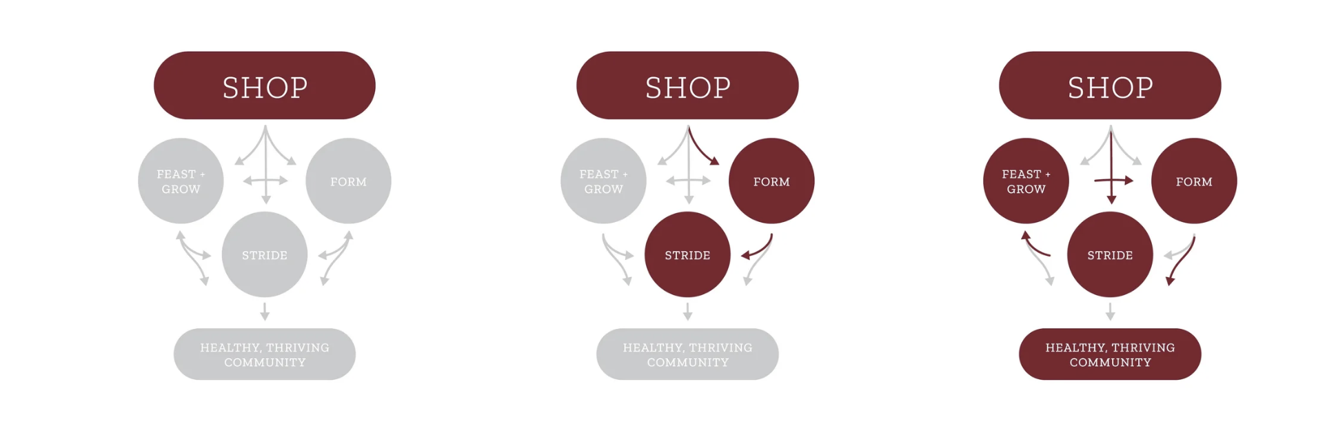
Journey Map variants
that explain the variety in individual, non-linear journeys shoppers and volunteers may take
Rather than creating a new explanation every time Kinship spoke to a different audience, the organization could begin with a shared visual foundation. The same diagrams now appear across annual reports, presentations, onboarding materials, fundraising conversations, and the website.
The diagrams not only explain the organization externally, they help create the shared internal understanding that propels Kinship’s mission on a daily basis.
Impact & Takeaways
Faster understanding. New audiences grasp the model in a glance, making Kinship’s work easier to understand and support.
Shared Foundation. Staff, board, and partners now have a shared framework for explaining Kinship’s work, creating more consistency across communication.
Reusable story blocks. The diagrams function as portable, on-brand building blocks—raising the information density of every deck, page, and handout while keeping it clear.
As organizations externalize their internal models, they create opportunities to discover gaps, align perspectives, and build shared understanding. The resulting diagrams become more than communication tools—they become shared reference points that help people coordinate around the same understanding.