Addressing overlooked design needs to improve network visibility
Even strong networks can fade from view without clear design.
When growth outpaces the brand
When a nonprofit organization grows, it does so deliberately—guided by consultants, boards, and strategic plans. At the same time, a nonprofit’s brand identity usually doesn’t get the same attention, and tends to evolve by necessity. A new program needs a logo. A report needs a designer. A campaign gets pro-bono support. Piece by piece, the brand takes shape without a clear map, becoming a collage of styles and interpretations.
An evolving visual style isn’t necessarily a weakness. Early on, it can be a mark of authenticity—proof of real need, resourcefulness, and community support. But when attention stays fixed on the urgent, a blind spot can form.
Every nonprofit leader knows how to prioritize growth, strategy, and funding. Yet brand clarity often sits in the “important but not urgent” corner of the list—until the consequences become impossible to ignore. Left unaddressed, that blind spot can limit visibility, credibility, and even funding itself.
A statewide network without a shared identity
This was true for Thriving Wisconsin. The organization administered a network of more than 30 member agencies across 72 counties and 11 tribal nations—but had no clear way to show the relationship between the administrator and the member agencies. Without a consistent way to represent the network, Thriving Wisconsin’s support and collective impact were essentially invisible.
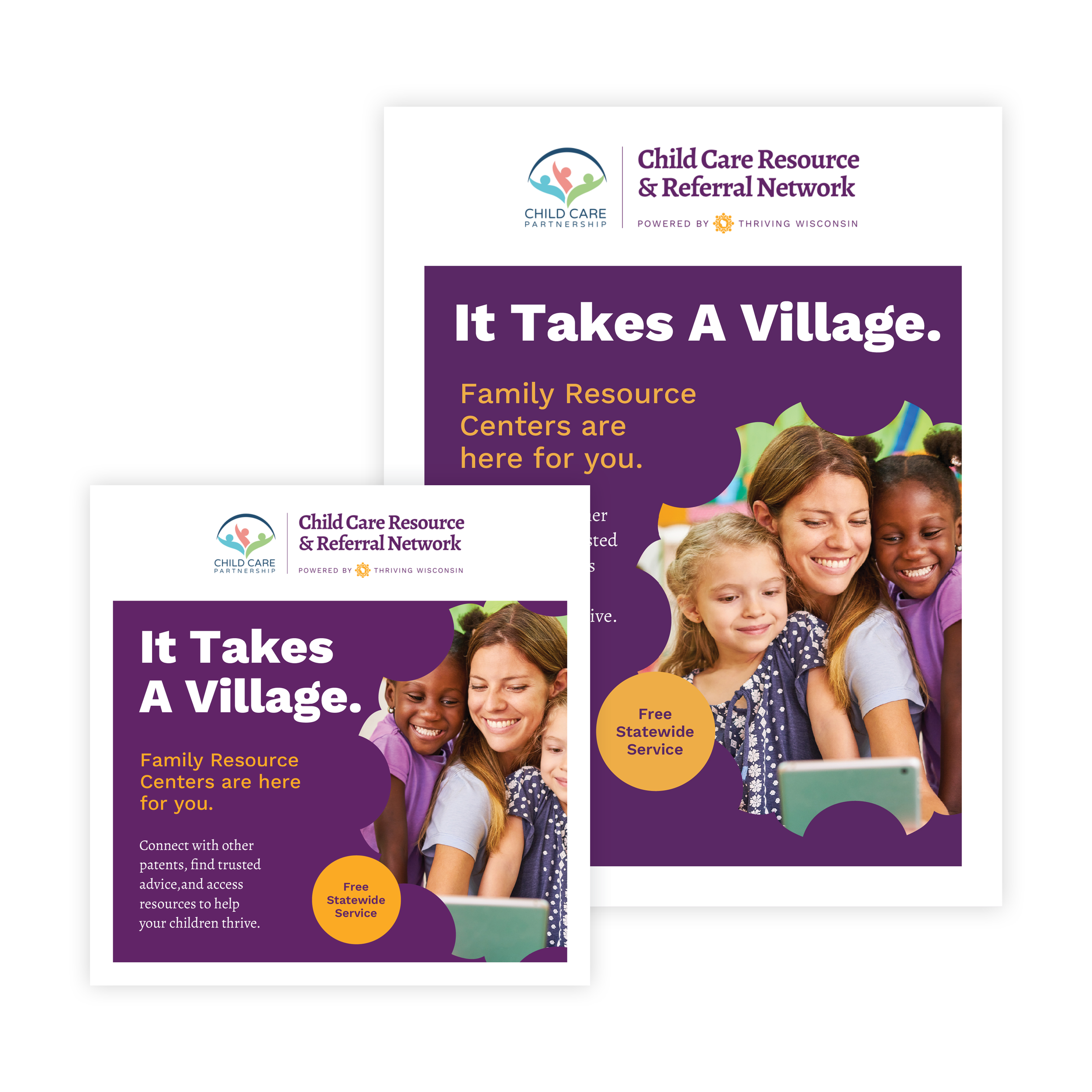
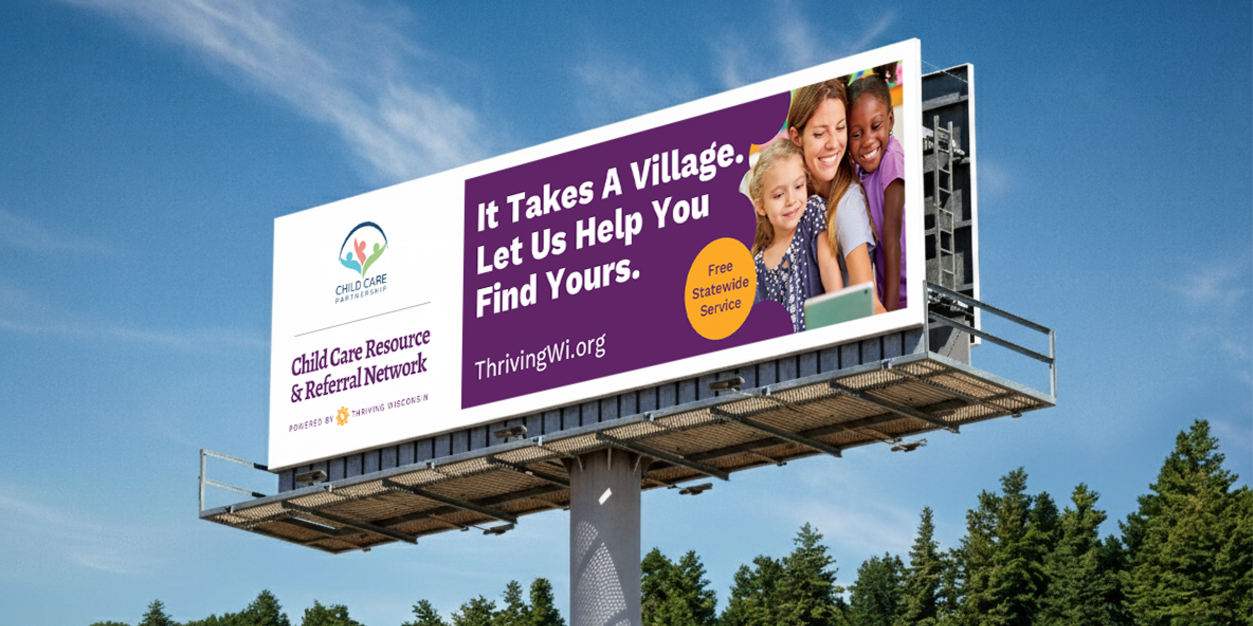
During the rebrand from Supporting Families Together Association to Thriving Wisconsin, this gap became impossible to ignore. RDG developed a co-brand system that made the statewide network visible and cohesive.


A flexible co-brand system built for scale
The system clarified the relationship between Thriving Wisconsin and its members. It was designed for scale, adaptable to local logos, and consistent across print, digital, and outdoor applications.
To support adoption, RDG created a toolkit with software-agnostic templates, a concise brand guide, and clear parameters for layout and color use. Every member agency could now produce professional, on-brand materials without relying on central design support.

From patchwork to presence
Today, Thriving Wisconsin and its network share a unified visual voice. A once-fragmented visual ecosystem now works together—simple, flexible, and built to last.
Creative Direction & Strategy
Lydia Ravenwood
Art Direction
Lydia Ravenwood
Graphic Design
Lydia Ravenwood
Sarah Schauf
David Arnevik